Storefront Components
The Storefront Editor comes with many components you can drag and drop to customize your storefront look and feel.
Layout
Layout components add structure and formatting to your page. They are useful for figuring out your page's arrangement when building from scratch. Layout components are further divided into the following:
- Accordion
- Horizontal rule
- Multi column layout
Accordion
The Accordion component adds collapsible content sections, useful for creating an FAQ section or organizing non-essential information. The video below shows how you can use the accordion component to display information:
Customization options
| Option | Usage |
|---|---|
| Allow multiple | Whether to allow multiple accordions to be opened at the same time. |
| Sections | Manage the individual collapsible sections and their titles. Each accordion section can contain text, images, or other content. |
Horizontal rule
The Horizontal Rule component adds a horizontal divider between sections. This is great for placing boundaries between objects and text. The video below shows how you can work with the horizontal rule component:
Customization options
| Option | Usage |
|---|---|
| Width (px) | Set the width of the divider in pixels. |
| Color | Choose the color of the divider using the color picker. |
| Make transparent | Toggle whether the divider is transparent. |
Multi-column layout
The Multi-column Layout evenly distributes multiple columns across the page, each serving as a container for content like text and images. this is awesome for presenting options and choices. The video below shows how you can work with the multi-column layout:
Customization options
| Option | Usage |
|---|---|
| Columns | Set the number of columns, up to a maximum of four. |
| Vertical alignment | Choose how to align content vertically within each column. |
Text components
Text components allow you to add formatted text to your page. Examples of formatted text include headings, paragraph text, and lists.
Heading
The Heading component adds a simple heading to your page. The video below shows how you can work with the header component:
Customization options
| Option | Usage |
|---|---|
| Text | Specify the text for the heading. |
| Level | Choose the header level, up to H6. |
| Text alignment | Choose how to align the heading text within its parent container. |
Rich text
The Rich Text component adds a text block with a rich text editor. The video below shows how you can work with the rich text component:
Customization options
The Rich Text component has editing options similar to a word editor. You can create lists, edit font colors, embed links, align text, and insert codeblocks.
Content
Content components add additional content to your page. This is awesome for seasonal themes like summer sales, holiday discounts, and physical store launches.
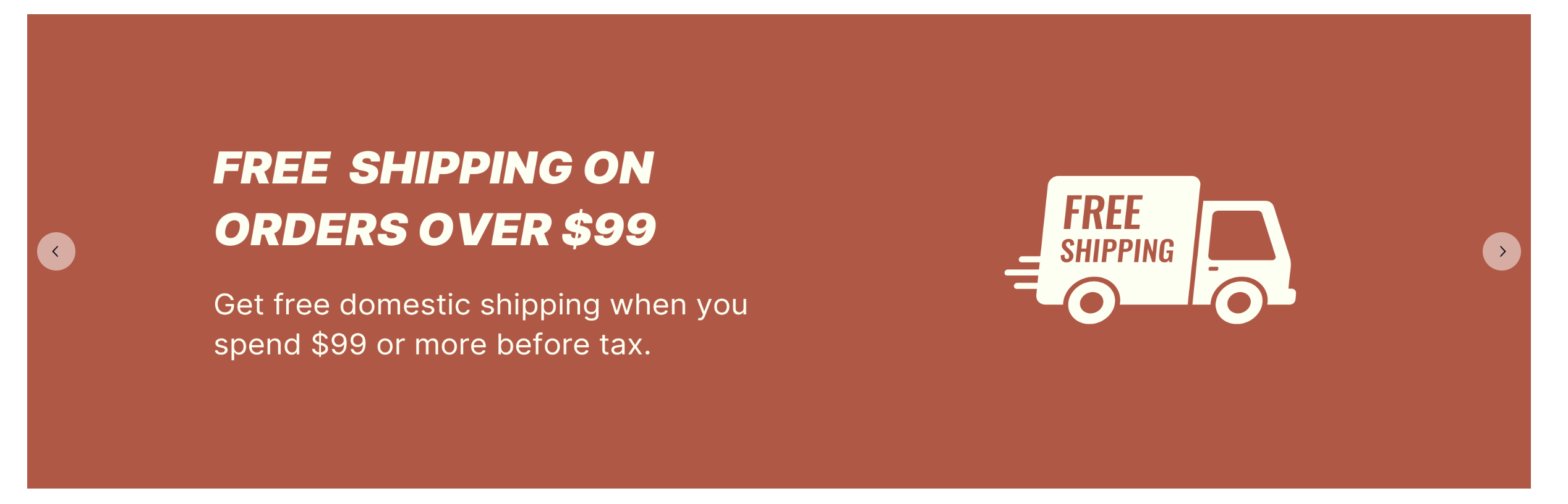
Hero section
The Hero section component highlights a prominent content area, typically featuring an image, headline, description, and call-to-action (CTA) button. The video below shows how you can work with the hero section component:
Customization options
| Option | Usage |
|---|---|
| Layout type | Select whether to display an image and how to arrange the layout. |
| Image | Choose an image to display. Images must be uploaded to your storefront media before you can select it. |
| Image URL | If using your own content delivery network (CDN), paste the image URL. |
| Image alt text | Enter alternative (alt) text for the image. |
| Round image corners | Choose whether to round the corners of the image. |
| Alignment | Choose how to align the content within the section. |
| Title | Enter the section header text. |
| Text editor | Add content to the text block. |
| Buttons | Display up to two buttons in the hero section. Customize button text, link, and style. |
Image
The Image component adds an image to your page.
Customization options
| Option | Usage |
|---|---|
| Image Source Type | Choose the image's source. Images can either be uploaded to your storefront media and selected or added using a link from an external content delivery network (CDN). |
| Image URL | Copy and paste the image URL from an external CDN. |
| Alt text | Enter alternative (alt) text for the image. |
| Aspect ratio | Set the image aspect ratio. |
| Rounded | Choose whether to round the image corners. |
| Link | Attach a link to the image. Be sure to prefix https:// to the image URL. |
| Open Link in New Tab | Indicate if you want the link to open in a new tab when clicked. |
Image carousel
The image carousel component creates a rotating slideshow that displays a series of images, allowing users to navigate through them using arrows or auto-scroll.
Customization options
| Option | Usage |
|---|---|
| Images | The image to display in the carousel. Each image must be uploaded to your storefront media before selection. |
| Size | Adjust the carousel's height. |
| Arrow position | Set the position of the carousel arrows (outside the image or overlaid). |
| Arrow type | Customize the arrow icons. |
| Auto scroll | Enable automatic scrolling of images. |
| Scroll interval (seconds) | Set the interval between auto-scrolling images. |
| Image Fit | Configure the image's structure (contain, cover, or stretch). |
Video
The video component embeds a video player from a URL. Supported sources include YouTube and Vimeo.
Customization options
| Option | Usage |
|---|---|
| Source | Specify where the video is hosted. |
| URL | Provide the video URL. |
| Video ID | The video ID auto-populates after setting the video URL. |
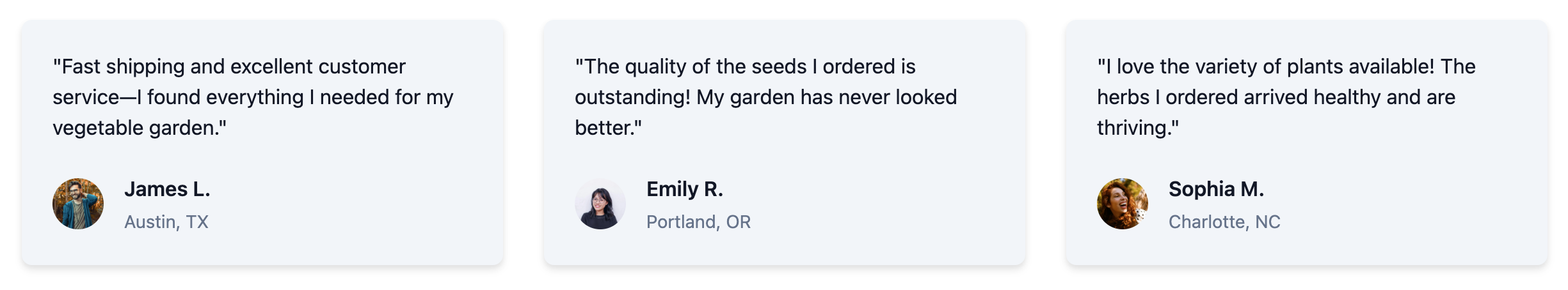
Testimonials
The testimonials component displays a grid of up to three quotes, each accompanied by a title, subtitle, and optional avatar.
Customization options
| Option | Usage |
|---|---|
| Title | Enter the section title. You can choose to show or hide this. |
| Title text align | Choose the alignment for the section title. |
| Testimonials | Add and manage quotes in the grid. Each testimonial includes a quote, main text, and subtext. Optionally, add a square avatar image by providing the image URL. Drag and drop to rearrange testimonials. |
| Style | Choose the style for the testimonial cards. |
| Drop shadow | Toggle a drop shadow effect for each testimonial card. |
Logo grid
The logo grid component displays a collection of brand logos in an evenly distributed grid, allowing users to visually browse featured brands on your marketplace.
Customization options
| Option | Usage |
|---|---|
| Layout | Select between vertical or horizontal arrangement for the logos. |
| Title | Enter the section header text. |
| Description | Add a description for the section. |
| Text alignment | Set the alignment for the title and description (left, center, or right). |
| Logos | Add logos by providing the URL to the image files. Add a description to identify each logo. Drag and drop to rearrange logos. |
| Show logo description | Toggle to display or hide descriptions beneath each logo. |
Button
The button component adds a clickable button with a link.
Customization options
| Option | Usage |
|---|---|
| Variant | Select the button's color and style variant. Available colors depend on the primary color set in your storefront settings.  |
| Size | Choose the button size: small, medium, or large.  |
| Content | Define the text displayed inside the button. |
| Link | Specify the URL or page that opens when the button is clicked. |
| Full width | Choose whether to make the button span the entire width of its container.  |
| Alignment | Choose whether to align the button on the left, center, or right section of the page. |
Product catalog
Product catalog components dynamically display collections and categories from your catalog.
Collection
The collection component showcases a collection's featured image, title, and description, with a link to the collection page.
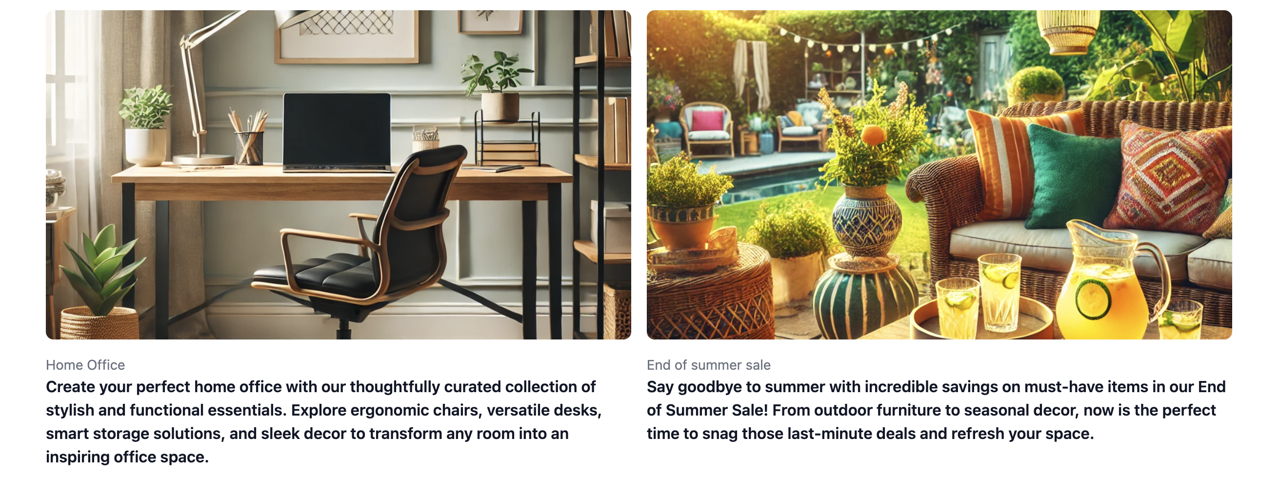
Customization options
| Option | Usage |
|---|---|
| Collection | Choose the collection to showcase. The collection must be published on your Dashboard before it can be selected on the Storefront. The image, title, and description are taken from what's configured on the collection. You can learn how to create and publish a collection here. |
Product category list
The product category list features a selection of categories displayed in a grid. Each tile shows the category image, title, and an optional description, linking to the category page.
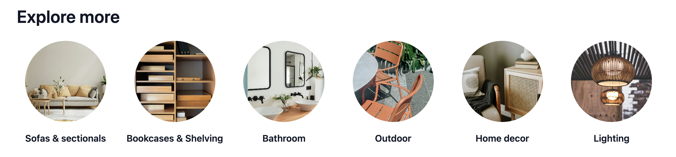
Customization options
| Option | Usage |
|---|---|
| Title | Enter the section title. You can choose to show or hide this. |
| Title text align | Choose the alignment for the section title. |
| Max number or elements per row | Choose how many categories to display across each row. |
| Product categories | Choose the categories to feature in the grid. The category image, title, and description are populated from the category settings. |
| Card style | Choose the style and shape for the category images. |
| Show category description | Choose whether to display the category descriptions beneath the titles. |
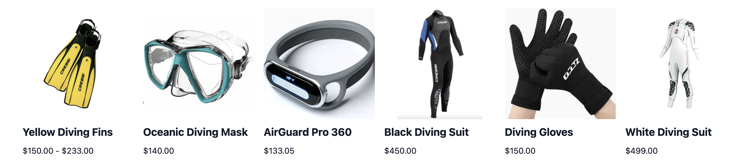
Featured products (collection)
The featured products (collection) component displays a list of products within a specific collection.
Customization options
| Option | Usage |
|---|---|
| Title | Enter the section title. You can choose to show or hide this. |
| Title text align | Choose whether to align the title's text to the left, center, or right section of the page. |
| Collection | Choose the collection to showcase. The collection must be published before selection. |
| Product name style |
|
| Product image style |
|
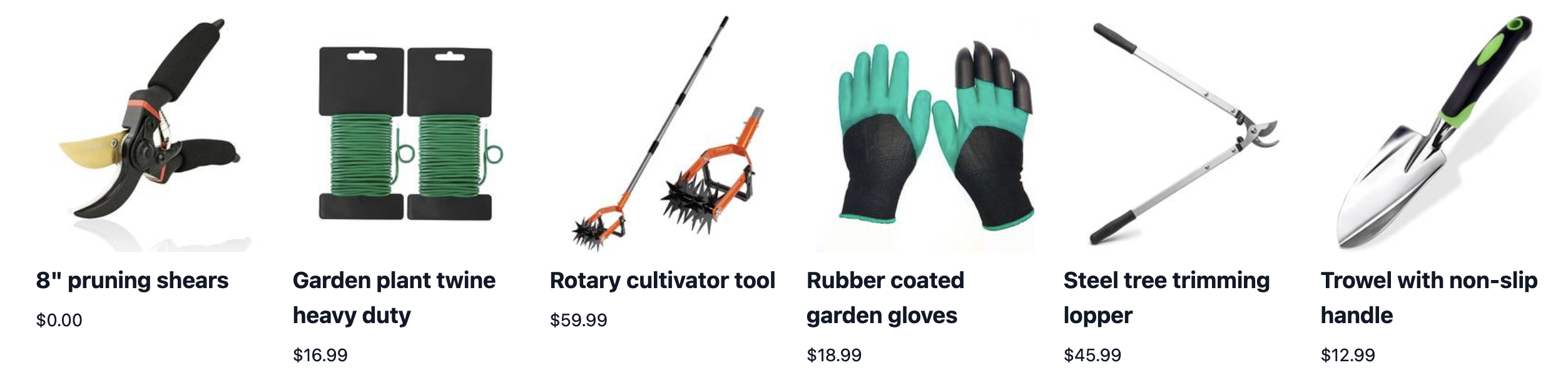
Featured products (category)
The featured products (category) component displays a list of products within a specific category.
Customization options
| Option | Usage |
|---|---|
| Title | Enter the section title. You can choose to show or hide this. |
| Title text align | Choose whether to align the title's text to the left, center, or right section of the page. |
| Category | Choose the category containing the products you want to feature. |
| Alignment | Choose whether to align the category's items toward the left or center section fo the page. |
| Product name style |
|
| Product image style |
|
Navigation Bar
Navigation bar components are used to search and highlight time-sensitive information.
Navigation Bar
The navigation bar component is used to look up products in your store and manage your store's navigation menu.

Customization options
| Option | Usage |
|---|---|
| Search bar placeholder text | Specify the text to appear as a placeholder in the search bar. |
| Navigation menu | Select a menu item to use for the navigation bar. You can learn more about creating menu items here. |
Announcement Banner
The announcement banner component is used to share and highlight important, time-sensitive information to customers visiting your store.

Customization options
| Option | Usage |
|---|---|
| Color | Configure the background color of the banner. |
| Text alignment | Select your preferred position for the banner's message. |
| Text | Type in the message to be displayed on the banner. |
| Text style | Edit the style of the typed in message. |
| Link text | This is optional. Edit the preferred text for your announcement's link and include the link's URL. |
| Link text style | Edit the style of your announcement's link. |
Footer
Footer components let you configure the footer section of your storefront.
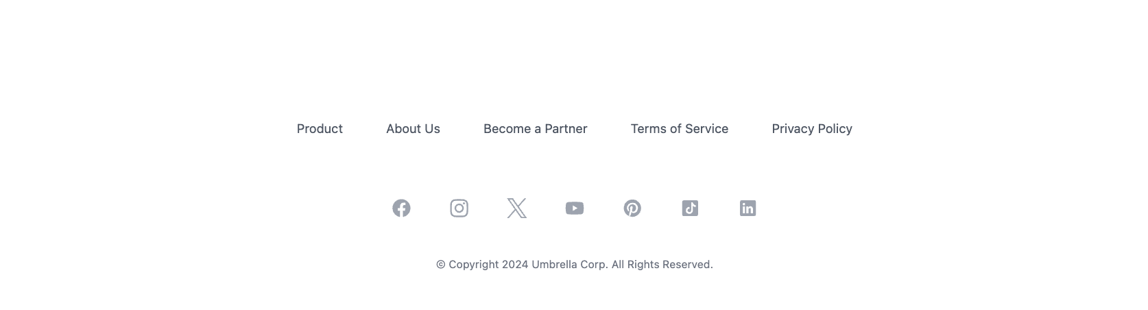
Simple footer
The simple footer component displays one menu of links across one row.
Customization options
| Option | Usage |
|---|---|
| Copyright notice | Specify the text to appear in the copyright statement. |
| Navigation menu | Choose the navigation menu to use for the footer links. |
| Social media | Add links to your social media pages. |
| Background color | Configure the background color of the footer. |
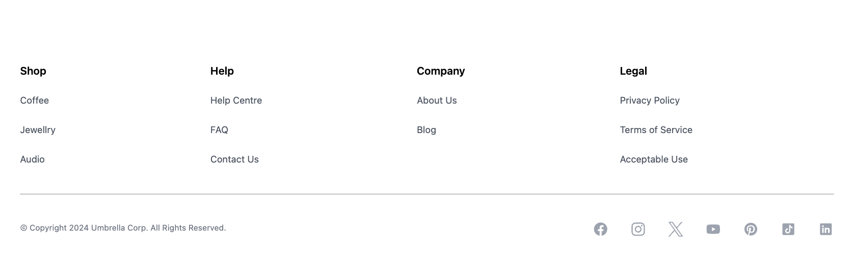
Column footer
The column footer component displays multiple menus across columns.
Customization options
| Option | Usage |
|---|---|
| Copyright notice | Specify the text to appear in the copyright statement. |
| Navigation links | Choose each navigation menu to display. Each menu appears as a column with its title and links. |
| Navigation links alignment | Choose the alignment for each navigation menu text. |
| Show divider | Toggle whether to display a horizontal divider between the navigation menus and other content. |
| Social media | Add links to your social media pages. |
| Background color | Configure the background color of the footer. |
Other
Other components include the Embed and Seller components.
Embed
The Embed component lets you embed links to your storefront. This is useful if you're looking to embed information like YouTube videos on your storefront. This component works with the oEmbed format to allow embedded representations of URLs on third party sites.
Customization options
| Option | Usage |
|---|---|
| Title | Modify the title of the embed link. |
| Type | Choose between embedding generic data or HTML content. |
| Responsive width | Choose to manually edit the link's width and position or make it responsive. |
| Responsive height | Choose to manually edit the link's height and position or make it responsive. |
Seller
The Seller component enables you to include direct links of your sellers on your storefront. This is handy if you are looking to feature your products according to each seller in your marketplace. You need to first create or invite sellers through your dashboard to use this component.
Customization options
| Option | Usage |
|---|---|
| Seller | Select the seller(s) you want to display on your storefront. |
| Show logo | Choose to show or hide the seller's logo. |
| Placement | Select the row or column structure for how your sellers are grouped. |
| Show name | Choose to show or hide your seller's name. |
| Show description | Choose to show or hide your seller's description. |